As we stated in previous Smart Farm Newsletter articles, in-season yield prediction is desirable information for producers. Recently, we had a very interesting chat with a farmer during AgSmart 2022. This farmer was asking about the procedure we adopted for yield forecasting in previous years. I explained to him this forecast was based on site-specific assessments of the crop yield calculated based on the number of heads and kernels per head sampled a few weeks before harvest.
The farmer's reaction to my explanation was: “I have been doing this for decades and that is how I know what will be my field average yields, so where is the innovation on this?” Although the farmer had a point, the emphasis of our yield forecast is not only to obtain the average yield for the field, but how and by how much the yield varies WITHIN the field. This information can be used while planning for variable rate application of fertilizers for next season, and obtaining this information a few weeks before harvest may result in better fertilizer price. Also, in the case of any environmental disaster (fire, hail, etc.) the within-field yield information would still be available guaranteeing continuity of data (important as we move to a data-driven agriculture), and this information could be used to accurately assess the loss. A previous Smart Farm yield forecast article presents a great example: when using a predicted yield map, it provided reliable information; however, before harvest the crop was hit by a hail storm. This caused over 50% of yield loss, which was also assessed by comparing the maps from predicted yield and yield monitor output.
In-season yield prediction has multiple applications in precision agriculture. Thus, the Digital Ag Team at Olds College of Agriculture & Technology has continued the evaluation of this tool as a component of the HyperLayer Data Project. For the past three years, Unmanned Aerial Vehicle (UAV also known as drone) and Sentinel 2 (S2) imagery were used for yield forecast evaluation, and stunning results were obtained. However, both technologies present positive and negative aspects.
While UAV imagery provides high-resolution data (centimeter-level), collecting and processing the data requires time, experience, licenses, etc. which reduces the scalability potential of this technology. On the other hand, S2 imagery is automatically collected and can be easily downloaded from HERE, thus a very scalable technology. However, it provides images with a lower resolution (10 m for red, blue, green, and near-infrared bands) and images are subject to effects of atmospheric conditions (clouds, smoke, etc.). In this scenario, we have decided to test another solution, PlanetScope (PS), also a satellite platform but with images acquired daily (versus a 5-day interval for Sentinel 2), which increases the probability of having good quality and clear images. In addition, PS imagery is provided with a higher spatial resolution (3.7 m) than S2 (10 m). Although this technology is very promising, it is important to mention that it is a paid service. However, Planet provides an Educational and Research Program which allowed us to have free but limited non-commercial access to PlanetScope imagery.
To forecast the grain yield on spring wheat, 20 locations within one of Smart Farm fields (Field 15/16) were sampled. These locations were selected based on multiple layers of data previously collected through the HyperLayer Data Project (soil samples, yield, proximal soil sensor, terrain, etc.). In each location, 1 m of the crop was evaluated by counting the number of heads and kernels per head (Fig. 1), in sequence, using thousand kernel weight (TKW) these values were converted to their equivalent in bushels per acre. The results are shown in Table 1.
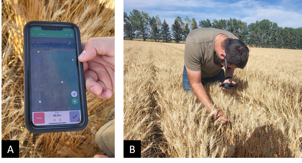
Figure 1. Student research assistant Dylan Laturnus (A) navigating to the sampling locations using an app on his phone (4farm) and (B) counting the number of heads and kernels per head in 1 metre.

Figure 2. Sampling locations and Normalized Difference Vegetation Index (NDVI) map for Smart Farm Field 15/16. Arrows and images pointing to high (left) and low (right) yielding locations.
 Table 1. Site-specific yield for the 20 sampling locations. Smart Farm Field 15/16.
During the yield sampling assessment, it was interesting to observe how well the Normalized Difference Vegetation Index (NDVI) matched with the high and low-yielding spots in the field. Figure 2 depicts this relationship by comparing the crop at sampling locations with high and low NDVI. In this image, the high-yielding spot refers to sampling point #2 presented in Table 1, where the yield was 147.3 bu/ac, while the low-yielding to the point #19 with 62.2 bu/ac.
Using the yield sampling results from Table 1 and data from a PS image collected on July 21, 2022, a “Virtual Yield Map” was generated (Fig. 3). Choosing the correct image to perform this process is an important step since choosing an image too early in the season, while crop canopy is not fully developed, may result in influences caused by the soil reflectance. On the other hand, collecting an image too late might cause influences from crop senescing which might not be directly related to the yield. In both scenarios, a bias is created in the results.

Figure 3. Yield map prediction (“Virtual Yield Map”) for Spring Wheat 2022. Smart Farm Field 15/16.
A suggested approach is to collect an image from the peak of the growing season, which for 2022 was determined to be around the third week of July (reason why the selected image was from July 21). Even though images from this period in the season avoid the issues previously mentioned, these images are known to present a phenomenon known as saturation on vegetation indices. This causes the index to stabilize even though there might be differences within the crop development.
During the process of calculating the predicted yield, we observed that using indices such as NDVI or Enhanced Vegetation Index (EVI) would saturate at yield values above 75 bu/ac (e.g.: Fig. 4A – yield increases but NDVI reached a plateau). Thus, we decide to explore the usage of the different spectral bands provided by PS imagery. Near-infrared (NIR) was determined to be the one that was less affected by the saturation (Fig. 4B) and better related to the yield obtained from the sampling locations, and used to generate the “Virtual Yield Map” for the yield forecast shown in Fig. 3. The generated map provided an average yield forecast of 81.59 bu/ac, a similar value to previous years yield when wheat was cultivated in this field.

Figure 4. Comparison between (A) Normalized Difference Vegetation Index (NDVI) and (B) Near-Infrared saturation for yield prediction. Smart Farm Field 15/16.
Overall, for the third year in a row, it was possible to create a “Virtual Grain Yield Map” for one of the fields from the Smart Farm. The accuracy of this map remains unknown at this point since harvesting at our farm is about to begin mid-September. Stay tuned for an update by visiting oldscollege.ca/smartfarm.
Felippe Karp, PhD candidate from McGill University, and Dylan Laturnus, Student Research Assistant